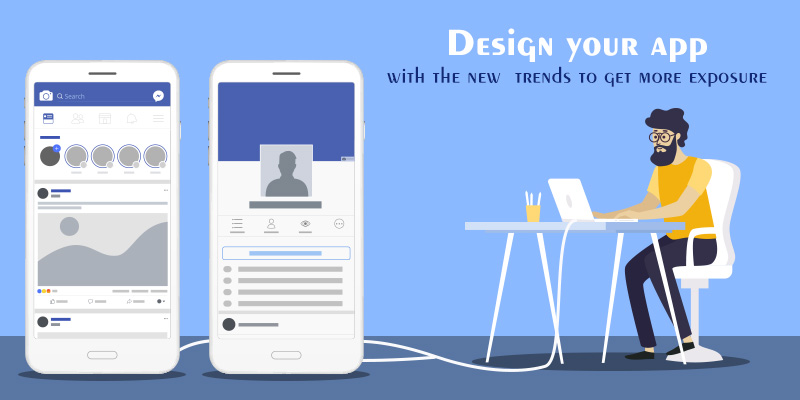
If you are running a business that connects with a mobile app and planning to start developing your own app, then the app developer should watch out the present trends. Mobile apps have become more competitive than before. Your app should be standing in the competition, hence design an attractive app and for that keep these trends in your mind this keeps you ahead in the competition.
Here are the list of top app designing trends should watch out:
Design a distractive free app
Adding more information become overloaded the app which leads to major problems. Destructive app influences the people doing many things other than what they want to do so there is a chance to uninstall your app. Distractive free app design depends on the UI design of that app, this kind of app keeps users focused on their purpose without distracting their attention. In mobile word processors and other products, the title uses this kind of design to keep users focused on their work.
Transparency
Background transparency is the trend in these days. Most of the users like glassy looks, it gives a unique feel to users. Transparency of the app depends on an interface and other components of that app. A technology used in different parts of a single interface helps to create the interesting virtual effects on the app.
Add new crispy icons
An icon is an attractive part of the app. The app should be in a crispy design that performs well with all screen sizes and adjust to all desktops, tab, and mobile screens. Design a unique icon for your app don’t put a similar icon which is standing in the market. For this graphic designer should work on re-evaluating the relatively small screens of phones and making sense of altogether better approaches to utilize that space. They are also dealing with excessively large icons that can lead to performance problems.
Card-based design
Cards contain images and text that are entry points to get more detailed information. Card divides content into the meaningful section and also can gather different pieces of information from one piece of detailed content. The designer should design the cards that have rounded corners and short shadow. Rounded corners make the card look like a content block and shadows give the impression of depth. Don’t overlap the cards and grids.
Material design
Material design provides a complete guide for visual, motion, and interaction design across platforms and devices. The designer can add dark material theme or light material theme. Use many material components to your app layout and navigation like toolbars, tabs, a bottom bar, and more. Include elevation shadows and cards, Animations, Drawables in material design apps.
By following the above mentioned mobile app development trends, you can make sure your app is functionally effective and visual treat full.
We at FuGenX Technologies have created some innovative apps for every business. Get in touch with us to discuss your next project through e-mail: info@fugenx.ae

